top of page

Besti SweetCorn

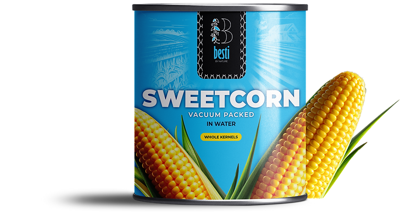
The goal of the Besti Sweetcorn packaging design was to craft an identity that would stand out on store shelves while remaining approachable and true to the essence of the product. Here's a breakdown of the considerations and steps involved:


To establish a distinct visual identity, we explored the designs of competing sweetcorn and vegetable brands.
Common trends included earthy tones, traditional layouts, and minimal illustrations.
While these felt familiar, they often
lacked a memorable edge.


Typography and Branding
The typography was chosen to align with the clean, modern ethos of the design. A sans-serif typeface with rounded edges helps convey friendliness and modernity. The logo prominently displays "Besti" to reinforce brand recognition, with "Sweetcorn" presented in a slightly smaller but equally readable font.

bottom of page